Powder Room Reveal: Small Space, Big Style Transformation
And Without Further Ado…
Powder Room Reveal
It’s been a minute since we’ve tackled a new room, but I’m excited to share this transformation! This powder room has come a long way since we first moved in, and we knew it needed to be more than just functional—it had to make a statement. With guests frequently using this space, we combined the two small, awkward rooms into one stunning, bold accent for the first floor. Take a peek at the journey from start to finish! Let’s start at the beginning…
A view from the hallway before we moved in (May 2021)
before
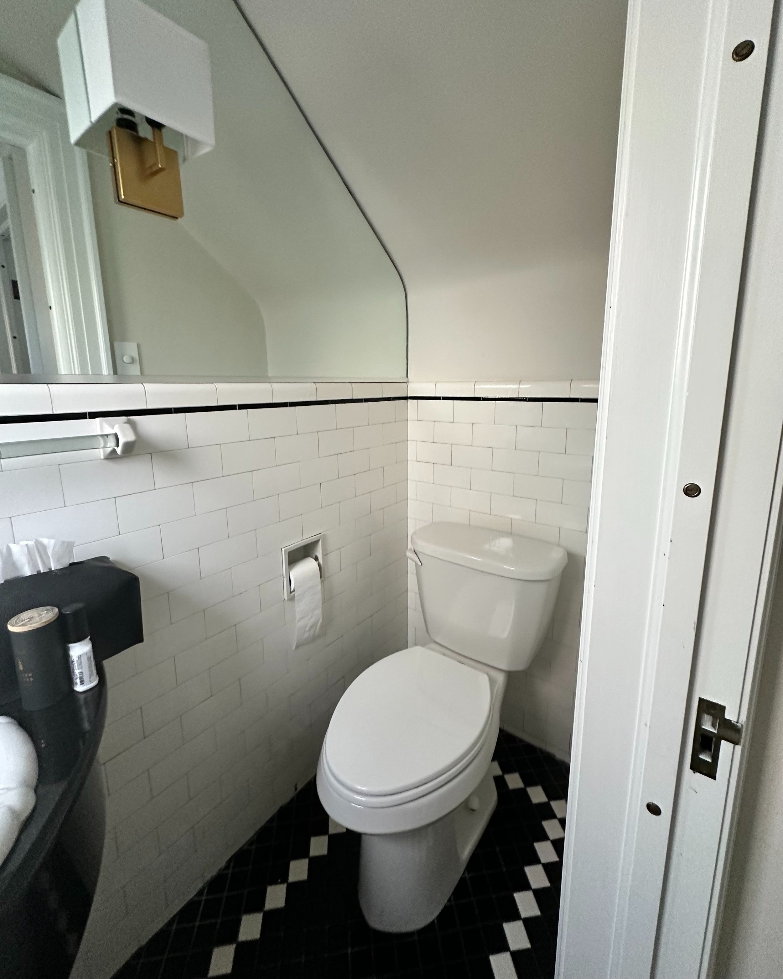
The photo above shows what the space looked like before we moved in—everything was covered in red paint and matching red wallpaper. To give it a quick refresh, we temporarily brightened things up by painting the walls and woodwork. It was a much-needed fix before we were ready to dive into the full renovation (see below).
To give it a quick refresh, we temporarily brightened things up by painting the walls and woodwork when we moved in.
Demo day!
let’s talk about
The Design Process
We worked closely with Michael P. Design of MichaelPDesign.com and Room to design the room to create a functional, stylish space. Given how small and narrow this room is, the layout was a challenge, but we decided to knock down the dividing doors to elongate the space, which made all the difference. We chose shade Night Shade for the wall with the mirror, perfectly complementing the wallpaper installed by 716 Accents on the other walls. The tile we selected for the floor adds texture, while the sleek faucet fits seamlessly into the space.
The sconces, which frame the mirror, add just the right amount of detail and additional lighting. We also upgraded from a smaller sink to this larger, more detailed one, which really enhances the room. For the fixtures, we went with Kohler, including this sleek bottle trap. And the toilet—we heard such great things about this model, so it was a must-have for our home.
LET’S GET INTO THE DETAILS
DECOR AND INSPIRATION
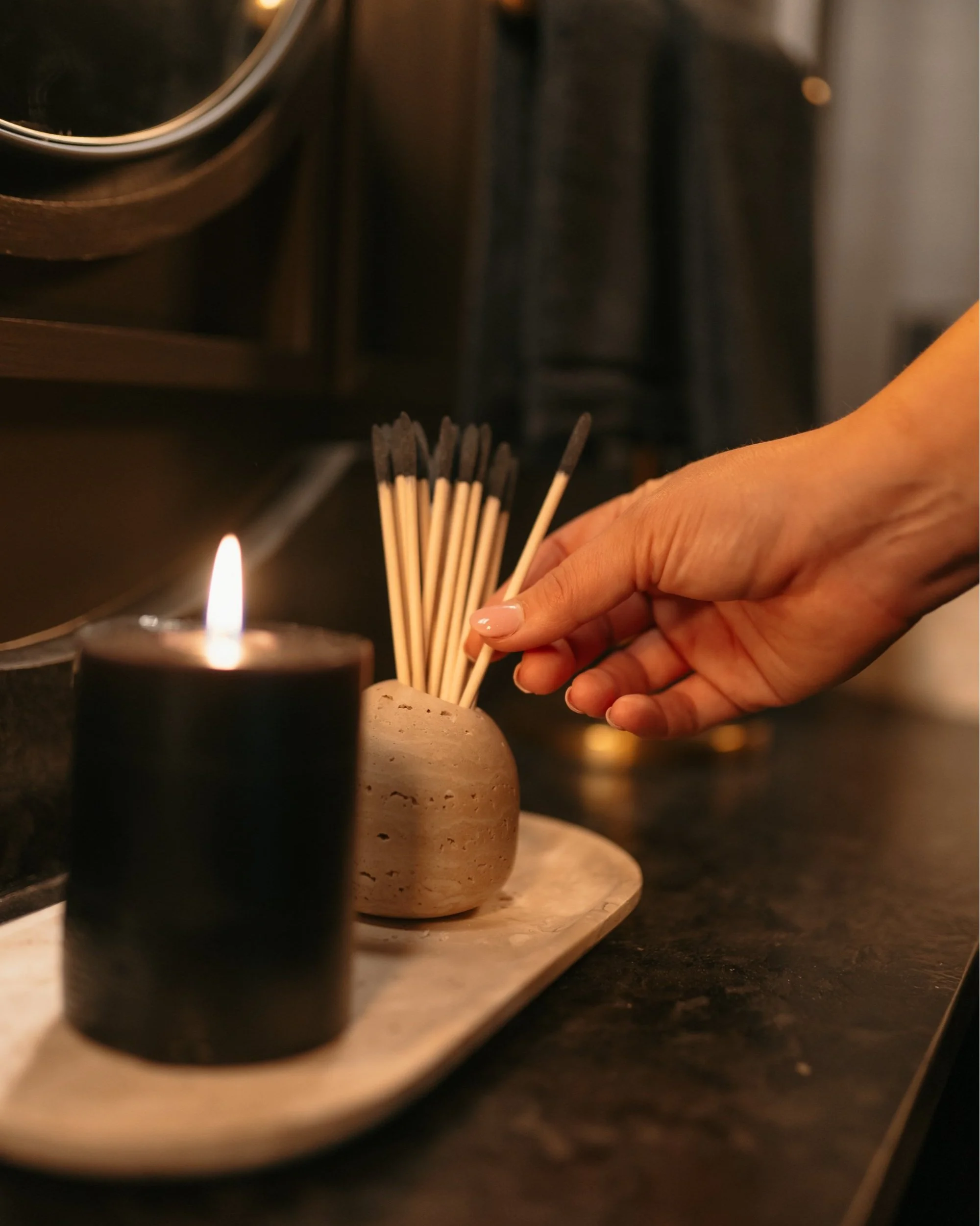
When it came to styling this room, we aimed for a blend of classic and modern pieces. This Grecian vase has been one of my favorites for years and fits perfectly into the space. We needed more light in the corner, and this rechargeable lamp with three light settings was the ideal solution. Coffee table books like this one and this one, like the ones we chose add the perfect touch to any surface—whether it’s a coffee table, end table, or countertop. Since this is our first-floor powder room and it gets plenty of use, tissues were a must. This this marble tissue box fits the decor shamelessly, paired with this matching tray, match cloche (with these matches), and waste basket to round out the look. I was on the hunt for an aesthetically pleasing candle and found this unscented one, which offers a striking contrast against the light marble accents. This towel rack ties in the gold details throughout the room, and these hand towels were the perfect final touch.
SHOP POWDER ROOM DETAILS
THANKS FOR READING
And that’s a wrap on our powder room reveal! I’m so excited about how this space turned out—it’s the perfect mix of functionality and bold design, making it a true standout on our first floor. Up next, we’re revealing our primary bathroom, so stay tuned for that! In the meantime, I’d love to hear what you think about this transformation. What’s your favorite detail? Is there something you’d add to your own powder room? Let me know in the comments below, and let’s chat about all things home design!
xx CMK
more room reveals you might love
Primary Bedroom Reveal
Living Room Reveal
Entranceway + Staircase Makeover
Closet Tour
Unpacking our Move: Things we learned
Photos by Ryan Kell


