Primary Bathroom Renovation Reveal: How a Pipe Leak Led to Our Dream Bathroom Remodel
Now introducing…
Our New Primary Bathroom
The journey to our bathroom remodel began with an unexpected twist: a massive leak in the pipes turned our cozy second-floor bathroom into a project we couldn’t ignore. What started as a simple repair quickly spiraled into a full-blown renovation, forcing us to go without a tub for over a year! But every challenge brought us closer to reimagining this space, transforming it from a functional necessity to a haven we truly love. Today, I’m excited to share the final result, the design choices, and all the little details that made this bathroom worth the wait.
See the full transformation here!
A view from the hallway before we moved in (May 2021)
before
The photos above and below capture what the space looked like before we moved in—complete with wallpaper, limited storage, and an awkwardly shaped bathtub. Later, when we had to rip the tub out due to the leak, the bathroom was left looking like a construction zone, tubless and incomplete, highlighting just how much the space was in need of a total refresh.
Demo day!
let’s talk about
The Design Process
We collaborated closely with Michael P. Design of MichaelPDesign.com and Room to design a space that functions seamlessly as both a primary bathroom and a child-friendly area. For custom cabinetry, we used NC Woodwork to bring in tailored storage and design. We chose this tile for the walls, this tile for the floor, this tile for the shower floor, and this one for the shower niche. Having been without a tub for over a year, we wanted a child-friendly yet stylish option, and this bathtub turned out to be the perfect choice!
To create space for a beautiful freestanding tub and a separate shower, we made the difficult decision to forgo the washer and dryer that were originally part of the layout.
For the faucets and fixtures, we opted for Kohler to compliment the room’s overall style and style selections. Our picks included this one for the tub, this one for the sink, and we have this shower head and this one with the matching handle for a cohesive look.
The sconces framing the mirror add the perfect touch of detail, while this carefully chosen sink enhances the room’s design. Lastly, we selected this highly recommended toilet model, making it an essential addition to our home.
Click on each photo for more details of what we used!
Use CARALYN15 at Weezie
LET’S GET INTO THE DETAILS
DECOR AND INSPIRATION
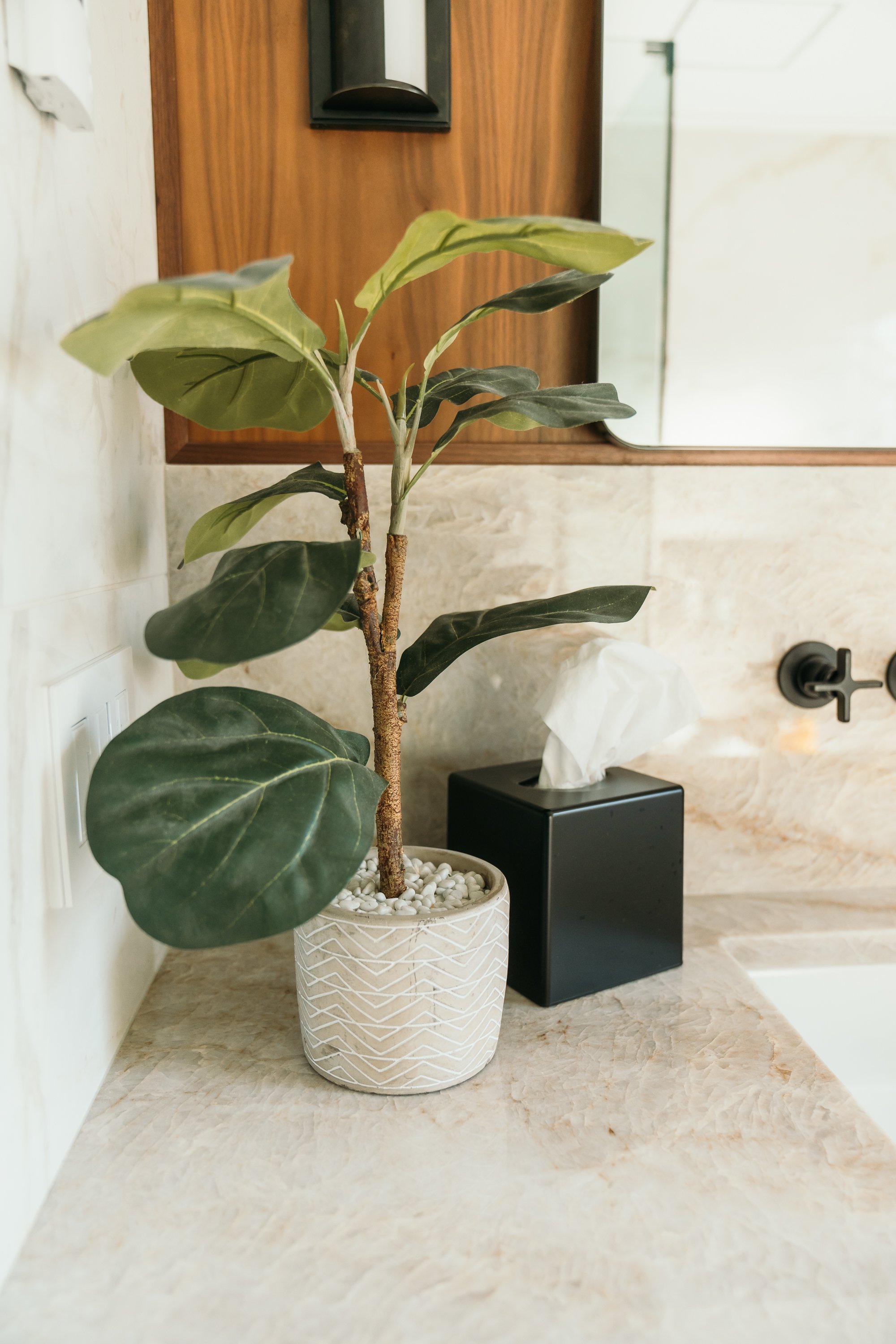
For styling this bathroom, we aimed for a balanced mix of classic and modern touches. We introduced a hint of greenery with a lifelike faux plant (see similar) near the sink and a small succulent (see similar) on the tub tray for a fresh look. To tie in with the room’s fixtures, we selected a coordinating tissue box cover with a matching soap dispenser and paper towel holder that seamlessly match our faucets and fixtures perfectly. The wooden birds add a charming, natural element to the counter.
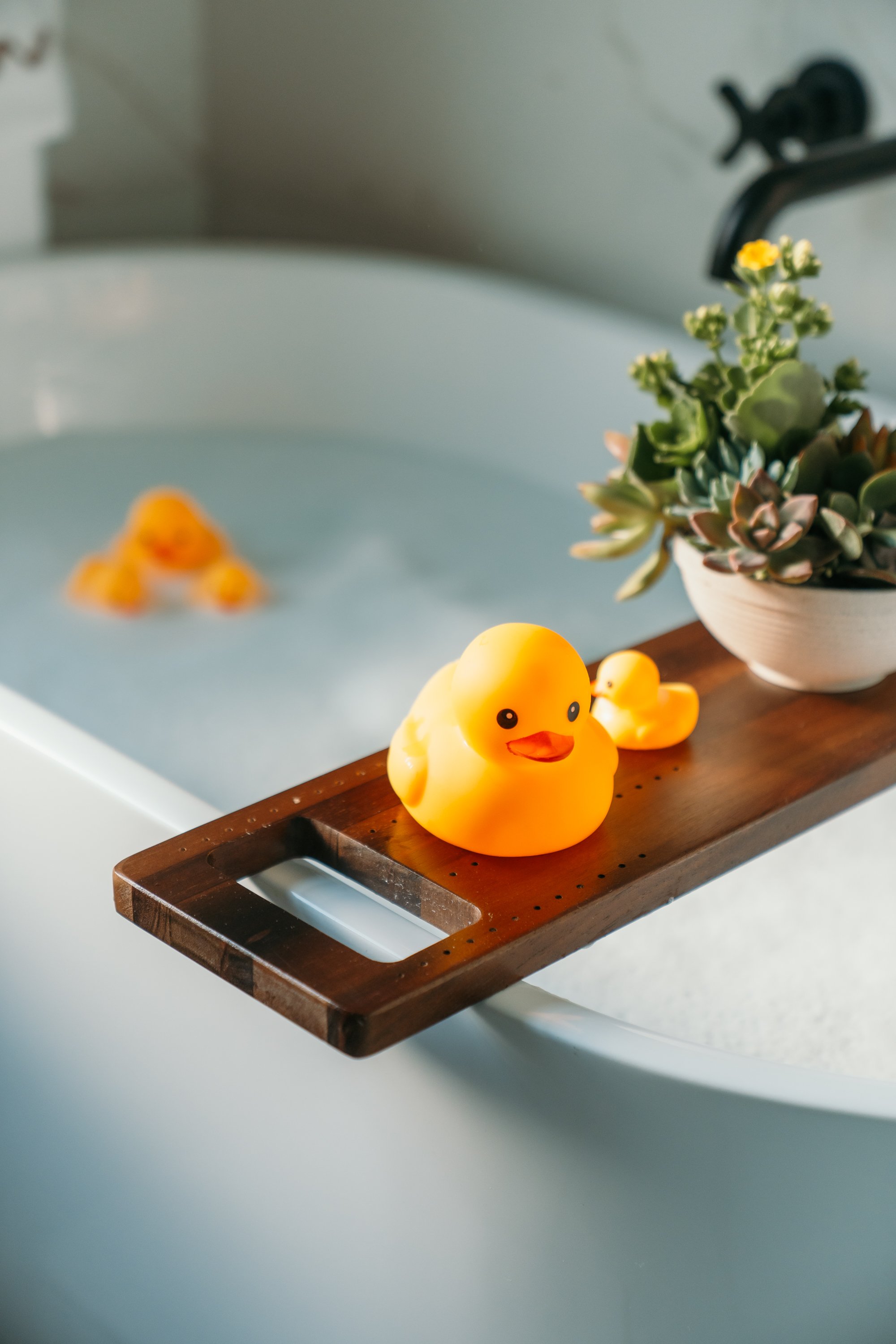
This versatile tub tray not only provides space for decor but also serves as a spot for these adorable duckies. These towels are some of my favorites, offering a touch of luxury and the option for personalization—use code CARALYN15 for a discount until 11/15.
Shop bathroom details
THANKS FOR READING
And that’s our primary bathroom reveal! We’re thrilled with how this transformation turned out, blending style and function into a space we truly love. Up next, we’ll be unveiling our guest bathroom makeover, so stay tuned—there’s plenty more inspiration to come! In the meantime, I’d love to hear your thoughts on this remodel. Do you have a favorite detail, or is there something you’d add to your own space? Let’s chat in the comments below about all things home design!
xx CMK
more room reveals you might love…
POWDER ROOM REVEAL
Living Room Reveal
Primary Bedroom Reveal
Entranceway + Staircase Makeover
Unpacking our Move: Things we learned
Closet Tour
Photos by Ryan Kell


